SAFETY SOLUTION
NightCommute
How digital tools can help people feel safer when travelling alone by increasing confidence, improving awareness and making support easier to access.
2025/2026 | UX Designer
THE PROBLEM
Most navigation applications optimise for speed or distance, but rarely consider a user’s perception of safety.
THE SOLUTION
NightCommute.
A mobile application that helps people travelling alone plan safer journeys, better understand their surroundings and access reassurance whenever they need it.
BACKGROUND
Adding Another Layer of Safety
Founded in 2016, Inclutech develops inclusive digital products that improve accessibility, communication and public safety. They work towards removing barriers to essential services by designing technology that supports people in situations where traditional methods of communication may not be suitable.
TapSOS is one of Inclutech’s safety solutions. It is a government-accredited 999 mobile application that enables users to contact all four emergency services without making a voice call.
As part of the wider TapSOS safety platform, NightCommute was designed to add another layer of safety for those traveling along, at night and/or in a city.
DISCOVERY
Understanding How People Experience Safety While Traveling Alone
Personal safety extends beyond simply reaching a destination. It should be considered when planning and during the journey. It involves reducing the uncertainty that can be present during the journey itself, particularly when navigating a city or somewhere during the hours of darkness.
Speaking to Users
When visiting a new city you often don’t know the areas that are busy, well-lit and considered ‘safer’. This leaves you trusting mobile navigation applications to make your way around. While navigation apps often direct users along the fastest route, they rarely consider how safe that route feels. This can lead people through quiet, poorly lit or unfamiliar areas that feel uncomfortable, particularly after dark. This was something that was discovered and verified during the design process when talking with the user groups.
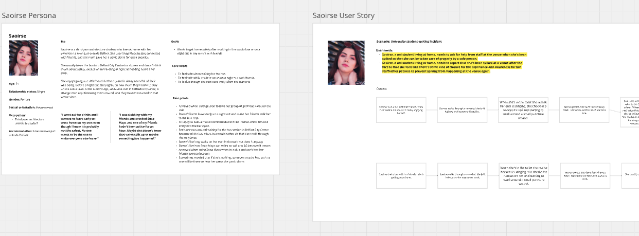
Personas & Storyboards
After communicating with the people of Belfast, the insights from this was used to create a number of user personas which were used to drive and maintain a human centred approach. These were important resources to refer back to at all stages of the process to ensure the user’s needs were being met. Each persona was given a specific user story based on the user needs and research. This part of the discovery process helped provide additional context around where the app could help solve the user’s concerns and problems. Additionally where we could help them to make informed decisions before beginning to travel and continue to feel supported throughout their journey.
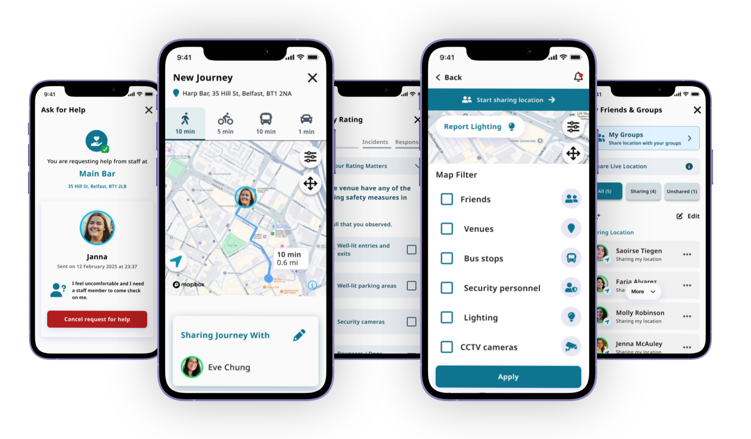
Share Live Journey
Allow trusted contacts to follow a journey in real time and receive confirmation once the user arrives safely.
999 and 101
Being a part of TapSOS, users can contact 999 in emergencies and 101 in non-emergencies discreetly while on a journey.

Venue Information
Community safety information to help users make informed decisions before travelling.
Street Information
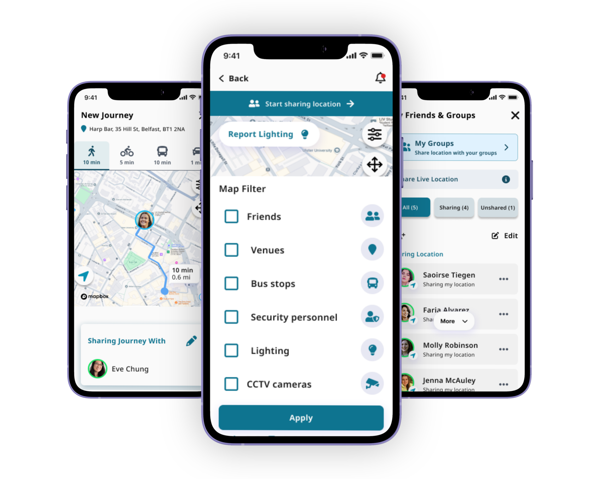
Users can view a map and their journey with filters to view their route and see what the CCTV, lighting and security is like
DESIGN DECISIONS
User Informed Decision Making
A key priority throughout the project was maintaining a human-centred approach to ensure the product reflected the needs of the users it was designed for. An important distinction was to ensure we didn’t rely on assumptions and made design decisions based on research. This allowed us to gain a stronger understanding of the concerns, behaviours and expectations of the users, in particular those of women and girls who would be traveling alone at night.
These findings during the discovery process and user interviews allowed us to pin point the pain points in their experience, along with what influenced them. This informed our decisions on possible features within the product. It also indicated which features they used and valued in existing navigation apps.
INFORMATION ARCHITECTURE
Translating Research into Product Structure
Taking on the points from the users along with their thoughts and experiences, we constructed a sitemap on how the product would be structured. This included a number of features that were aimed at providing reassurance and helping people feel safer.
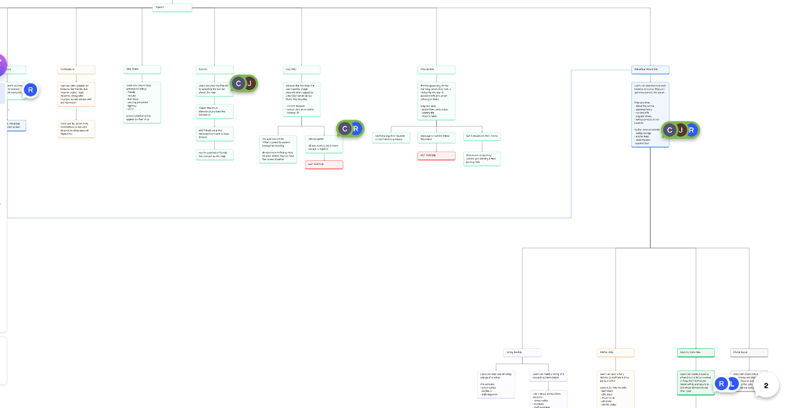
Examples of features
It was vital the product was easy to navigate, particularly if the user finds themselves in a stressful situation. Creating the information architecture with this in mind, along with the user’s needs, was let in making sure the relevant information available at the appropriate time.
CREATION
Designing & Validating the Solution
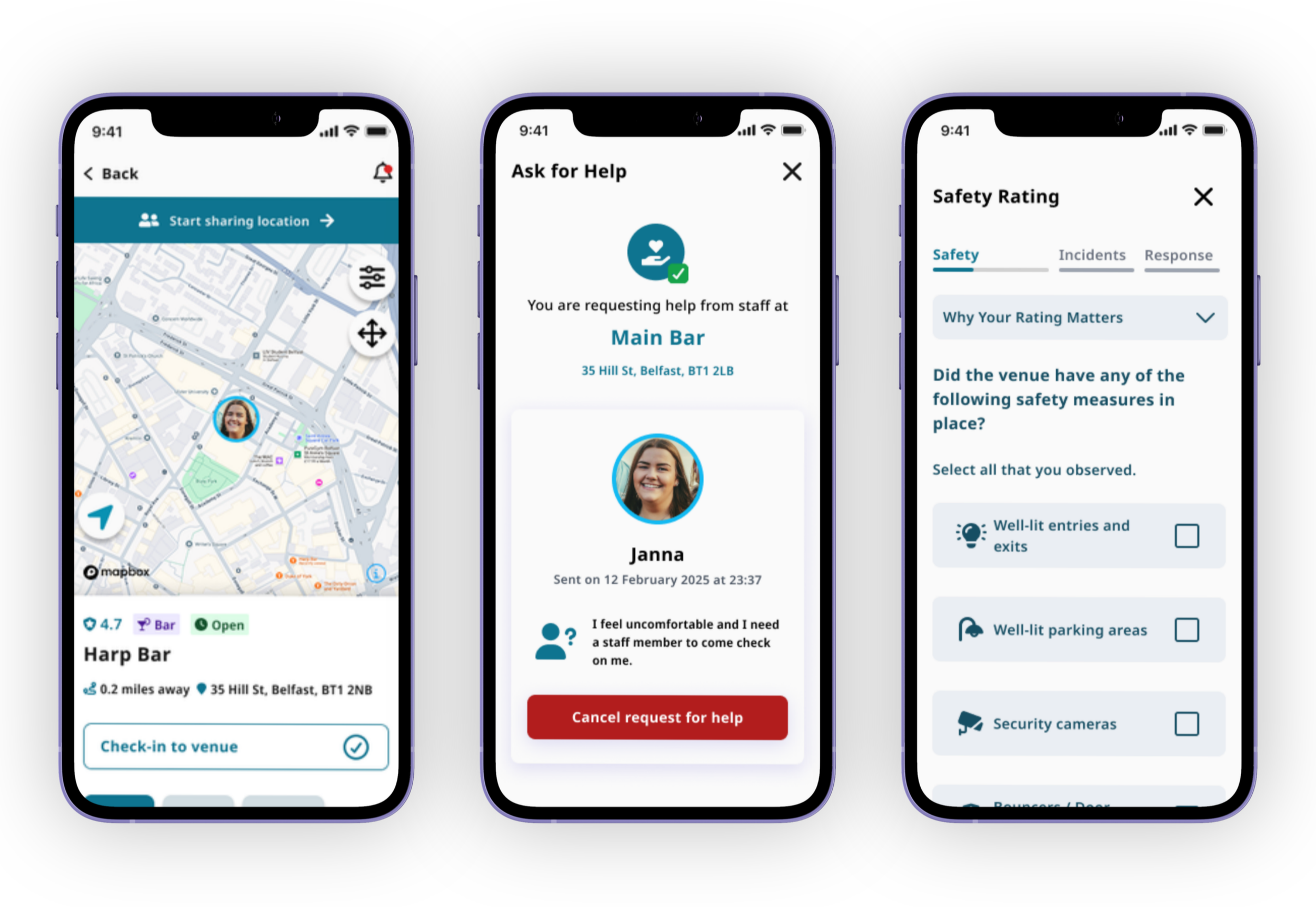
Using all the information we had gathered, we translated the user needs into user flows, low-fidelity wireframes, high-fidelity prototypes and interactive user journeys. These designs were then validated through usability testing with user groups. Making adjustments based on feedback from these user groups allowed us to review and refine the experience based on the input from the user’s themselves.
As the product developed to a functional high fidelity prototype, it was progressed into a live pilot involving 200 plus participants recruited via CARD Group. This process combined post questionnaires with analytics through DataDog, which allowed us to understand what the users told us and compared with how they interacted with the product in real world scenarios.
REFINEMENTS
Iterating Alongside Users to Build Confidence in the Product
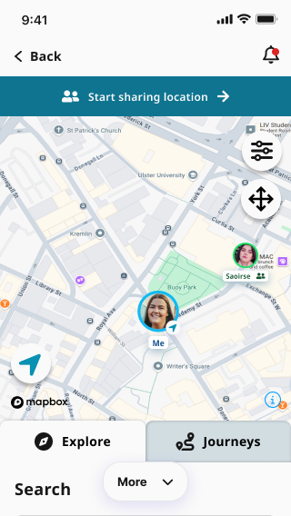
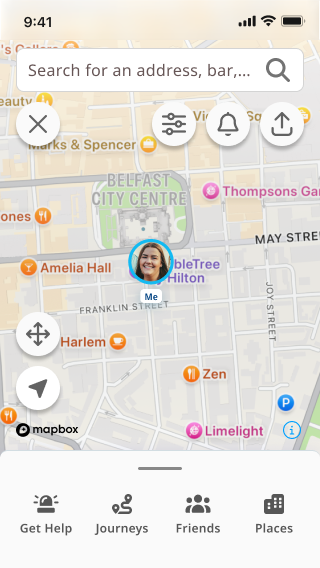
This research highlighted a number of areas of adjustments. Pilot testing highlighted several opportunities for refinement. Users indicated that they strongly valued the concept and appreciated the safety focused approach. However, multiple struggled to discover the core features that would help encourage their safety. This feedback pushed us towards a cleaner onboarding, simpler navigation and improved visibility of key actions. Tools like DataDog allowed us to pinpoint the areas of drop-off during the user journey.
Combining research, usability testing, pilot feedback and analytics allowed us to confidently refine the precast into an experience that was intuitive. This ensured that the experience was completely aligned with the suer’s needs and expectations.
Before
After
THE OUTCOME
A Safety Product Driven by the People Who Need It
NightCommute demonstrates how navigation experience can evolve beyond simply directing people from one place to another. It offers users the chance to make informed decisions before they begin their journey, while also giving them the tools to fuel confident and reassured while on their journey.
User research, usability testing and pilot analytics helped validate the design decisions throughout the project and ensured the final experience remained grounded in real user needs.
Reflection
Being a part of this process has reinforced to me that designing for safety is about more than simply adding features. It is about understanding how users feeling during an experience and this is why a human centred design approach is vital. It also showcased the importance of gaining feedback and how every round of feedback created opportunities to improve the experience. Being willing to accept criticism and take on constructive feedback, will benefit the user’s experience dramatically. By listening to the users it reminds us who we are designing for.
This process did produce a number of challenges, including fitting multiple features into the product on a small form factor and working with maps. This project improved my problem solving skills by having to get out of my comfort zone and work with new elements. While this was a challenge, it is one I relished and I feel I have become a better UX designer as a result. Additionally, it reaffirmed the value I hold for being part of a team, bouncing ideas of each other and solving complex problems.