WEB PORTAL
Digitising a Paper-Based Process
Transforming a manual pen and paper workflow into an intuitive web portal to improve efficiency, accuracy and the overall user experience.
2026 | UX Designer | 4-6 Weeks
THE CHALLENGE
How might we transform an inefficient manual process into a digital experience, within tight timeframes.
THE SOLUTION
Improve both the user experience & operational efficiency across all user roles.
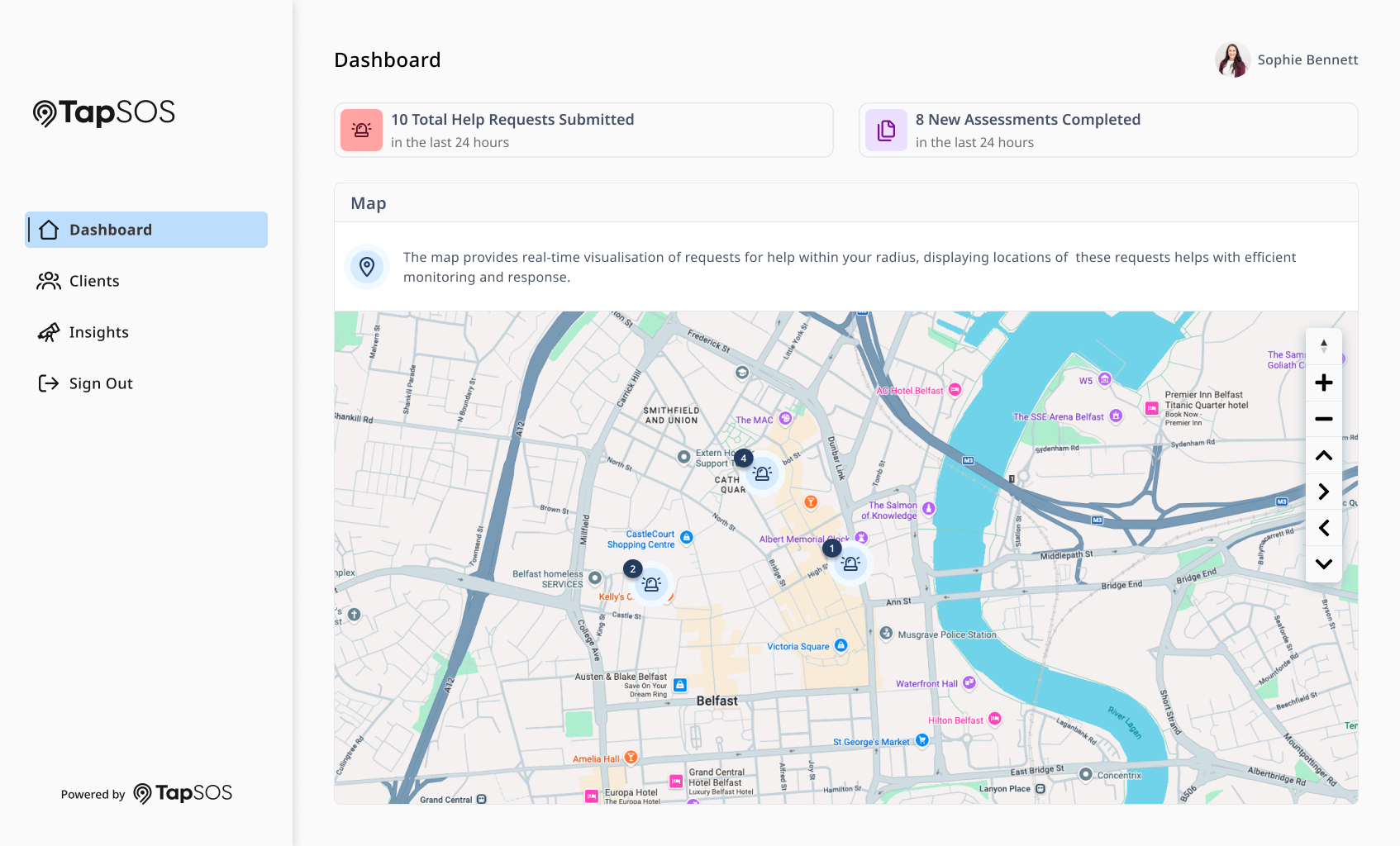
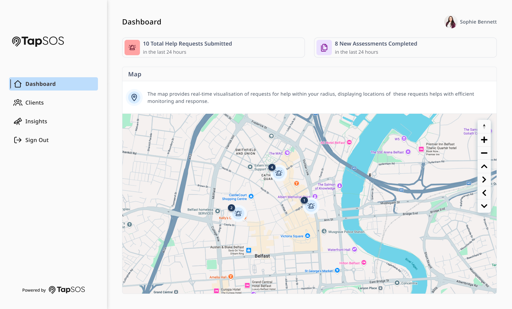
Landing dashboard for full access users with real-time visualisation of reports. Note: content is fictional.
From Pain Points…
Time Consuming
The process of using pen and paper took time for the users to complete the form fully.

Paper Storage
Each form was on a different piece of paper which made it difficult to track and search past reports.

Human Error
There were multiple risks of human error due to written text that could be misread or have spelling mistakes.

Inconsistent Completion
Forms would have been inconsistently filled out with users taking different approaches.
To Improvements!
Digital Records
Replaced paper storage with searchable, secure and easily accessible records.

Improved Accuracy
It minimises the errors by capturing information digitally rather than being hand written.
Consistent Data Entry
Users are guided through a consistent process to improve data quality and completeness.

Streamlined Workflow
Forms will be completed faster with less time needed to process the form.
BACKGROUND
Transforming a system from paper to web.
The client had been relying on a paper based system to complete important operational forms that would include sensitive information. These forms would be completed by hand and then transported to their office to be manually transcribed into a computer system. This system was strenuous, inefficient and left numerous chances for human error.
This project had a limited delivery timeframe. It left only a handful of weeks to understand the existing workflow, identify user pain points and design a web portal. It was essential to identify high-impact improvements and prioritise them with informed design decisions that were made quickly.
It was important to focus on the core user journeys, while maintaining collaboration regularly with stakeholders, we were able to deliver a solution that balanced speed with usability. The direct result of this system on the users was that it made daily tasks unnecessarily time consuming and tedious. It was clear from the start the benefits moving the client to a digital web portal would be.
DISCOVERY
Mapping Out the Process
Stakeholder Interviews
To help the team gain a clear understanding of the client’s existing process we carried out interviews with stakeholders and staff users. These conversations helped to uncover current workflows and systems, company standards and requirements, along with any day to day challenges. This allowed us to adopt a human-centred approach by ensuring the solution being created was informed by the needs of the people using it.
Visualising the Process
Through the interviews, additional research and documentation provided by the client, we mapped out and discussed the paper based workflow. From here, I visualised the process by identifying each step, from start to finish in the user’s journey. Visualising the process helped me understand the system currently being used and allowed me to brainstorm ways to make improvements.
Identifying Pain Points
It was clear from talking to staff and stakeholders that there were a number of pain points with the current process. Particularly with those who are responsible for transcribing the paper forms into the computer system. This highlighted one key challenge that we could solve by introducing our web portal. A number of other pain points identified included:
Staff members filling in the form incorrectly or not being fully completed
Confusion when reading handwriting dependant on how quick the form was filled out
Higher risk of human error across the paper process
Ability to search through historical forms
These insights helped to prioritise the key areas that would delivered the greatest improvement when digitised.
Points of Improvement
Using the findings from the discovery process, I was able to identify opportunities to modernise the experience and make it more efficient. The redesign focused on consistently reducing the time of the process from start to end, ensuring users fully completed the form, reducing the risk of human error and creating an intuitive workflow for all users.
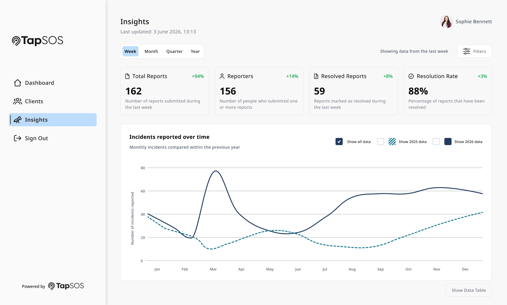
Insights screen to modernise how the client can analysis their reports. Note: all content is fictional.
CREATION
Designing the Solution
With this project under time constraints and having a number of different portals designs, the initial design process was quicker. Working as a team, we worked out the user flows and architecture which helped to inform design decisions, all while ensuring I followed a human-centred approach.
I utilised the design system along with existing and proven portal design concepts from previous projects I had worked on. This was particularly helpful when working under a deadline. My process still remained the same. I brainstormed and sketched the designs, using the existing resources as the building blocks. From here, I moved onto Figma to transform the low fidelity sketches into high fidelity versions.
Overcoming Challenges
During the discovery process we distinguished that there was two different user types:
Managerial roles with fully access
Staff ‘on the ground’ with limited access
The limited access scenario consisted of creating, completing and submitting forms. These users would not have access to features like insights, report history and patron information. This resulted in a number of design challenges. In particular how the large format screens would look with a reduced amount of content.
To combat this, I carried out some competitor analysis and research to discover what the best route forward would be. I created a few iterations and utilised team discussions and feedback to come up with a solution where it isn’t obvious how much content was removed at this access level.
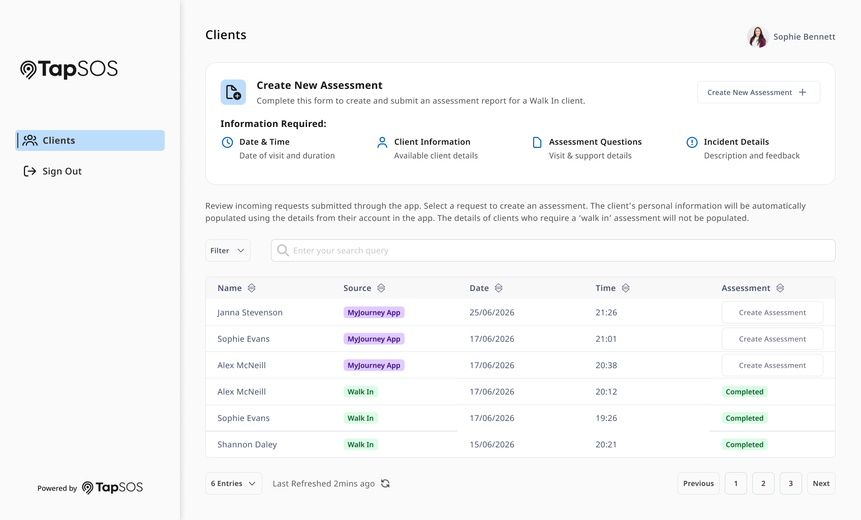
The landing page for limited access users. Note: all content is fictional.
THE IMPACT
Improved Efficiency. Reduced Barriers.
The final outcome was a fully designed and developed web portal that transformed an inefficient paper based process into a streamlined digital experience for all users. The solution enables users to complete forms faster while also reducing the manual effort and risk of human error. Initial feedback from stakeholders and users before pilot reflected and indicated this successful outcome.
By following a human centred design approach to redesigning the workflow, this project demonstrates hoe considered UX design can improve both the user experience and operational efficiency. The solution addresses multiple pain points that were identified during discovery, resulting in a faster, more intuitive process.
Reflection
This project reinforced to me the value and importance of each step of the UX process, but also how to complete it at pace without losing any value. This process strengthened my ability in simplifying complex systems into intuitive ones, in particular while working within tight project timelines.
Looking back, this project taught me that the transformation from paper to screens is not simply about replacing paper with something digital. A key learning was understanding how people actually use the paper format and the implications of this for everyone. Then using this information to deliver a solution that genuinely improved their experience.
Working closely alongside the leadership and development teams, both during design and development, strengthened my ability to communicate my ideas and the reasoning behind them. Additionally, working together to identify and solve problems across the project.