Apollo 11.
In my second year, I was tasked with creating an Interactive Prototype and Narrative Website based around the Apollo mission. I had creative freedom, only having to use content around Apollo within the design.
Work from 2023


Research.
To begin this project, I wanted to gather as much information on Apollo missions that I could. I was given a short document within the brief with some information, so I wanted to align my research with this and organise it accordingly.
After completing Apollo 11 specific research, I looked at immersive website design for some visual inspiration. I created some collages of websites that stood out to me and ones with elements I liked. Similarly, I looked at space specific websites for further inspiration.
I looked at magazines and how they structure their pages and utilise text. I also looked at storyboards and sketchbooks, which would link well if I wanted to take an illustrative approach again.
I found this really interesting, thinking how I could take the paper design and convert that into a website design. I feel like this also links well with creating a narrative, as these books designs tell a narrative. So I feel like if I can do this well, I’ll be able to tell a narrative not only with the content but also the design.
I started with my sketchbook, moving my concept to paper. The initial sketches were for the home page and I moved out from there. I had a few designs for how I could place the information and images together. To create consistency I reused these across all the pages.
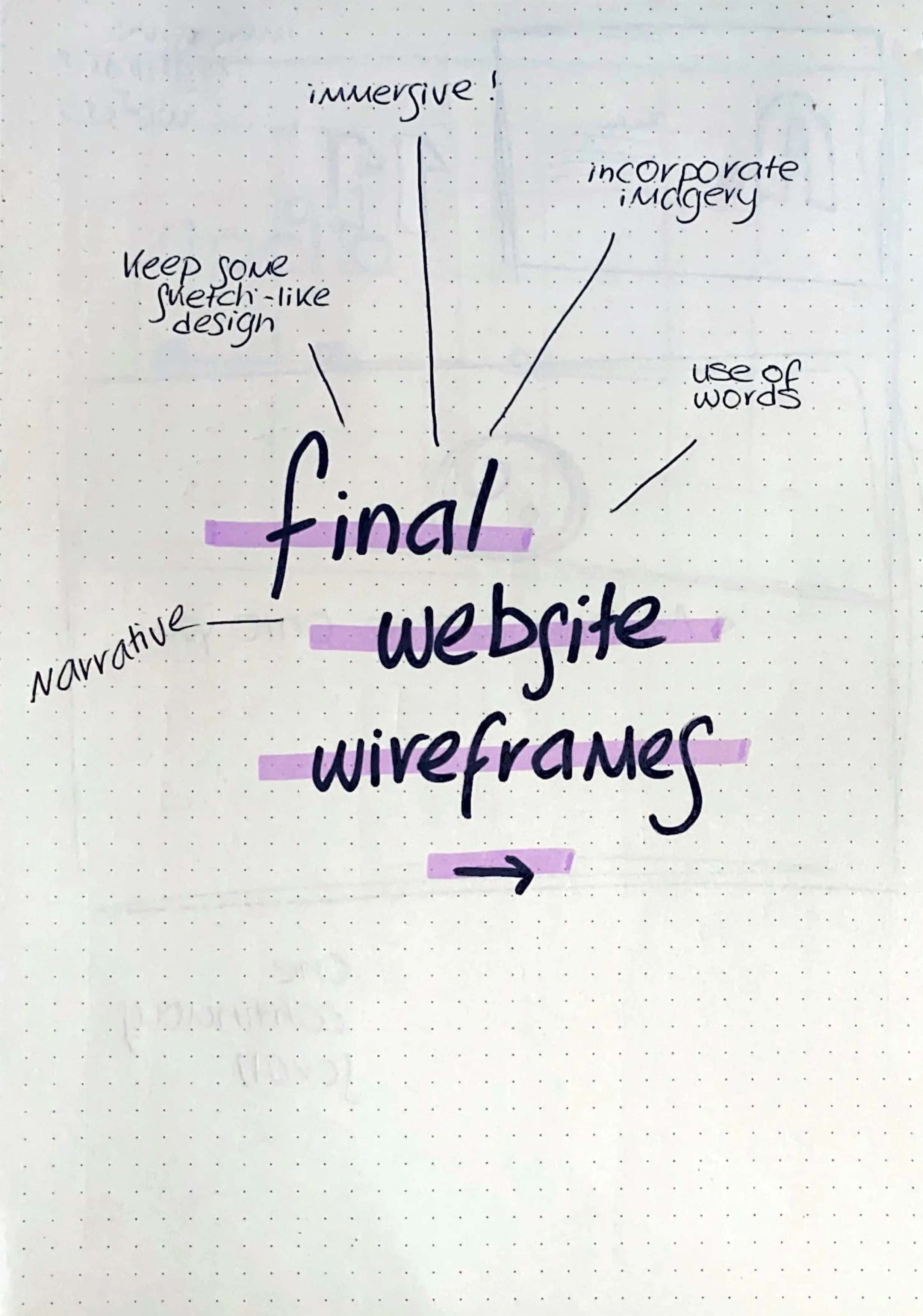

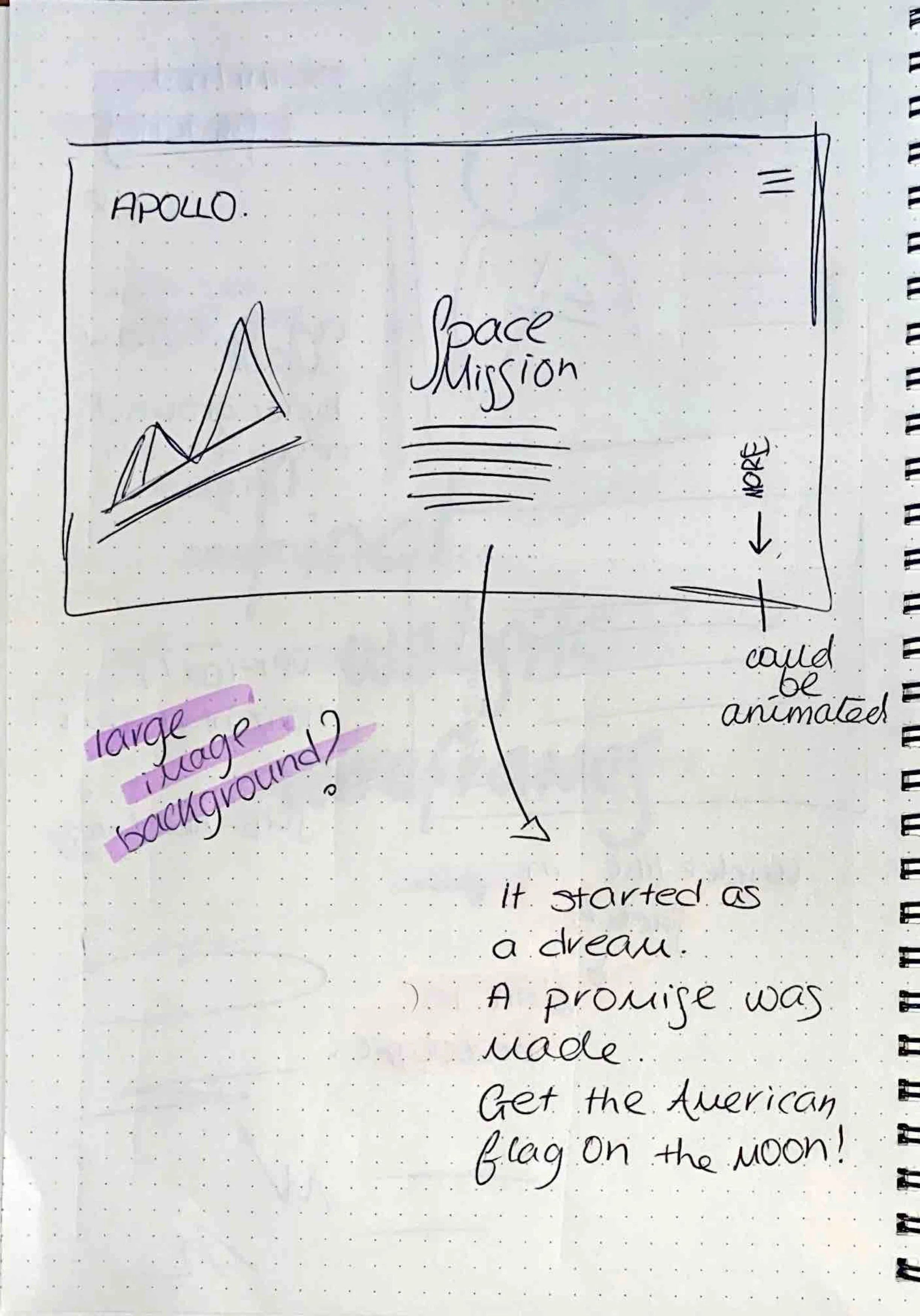


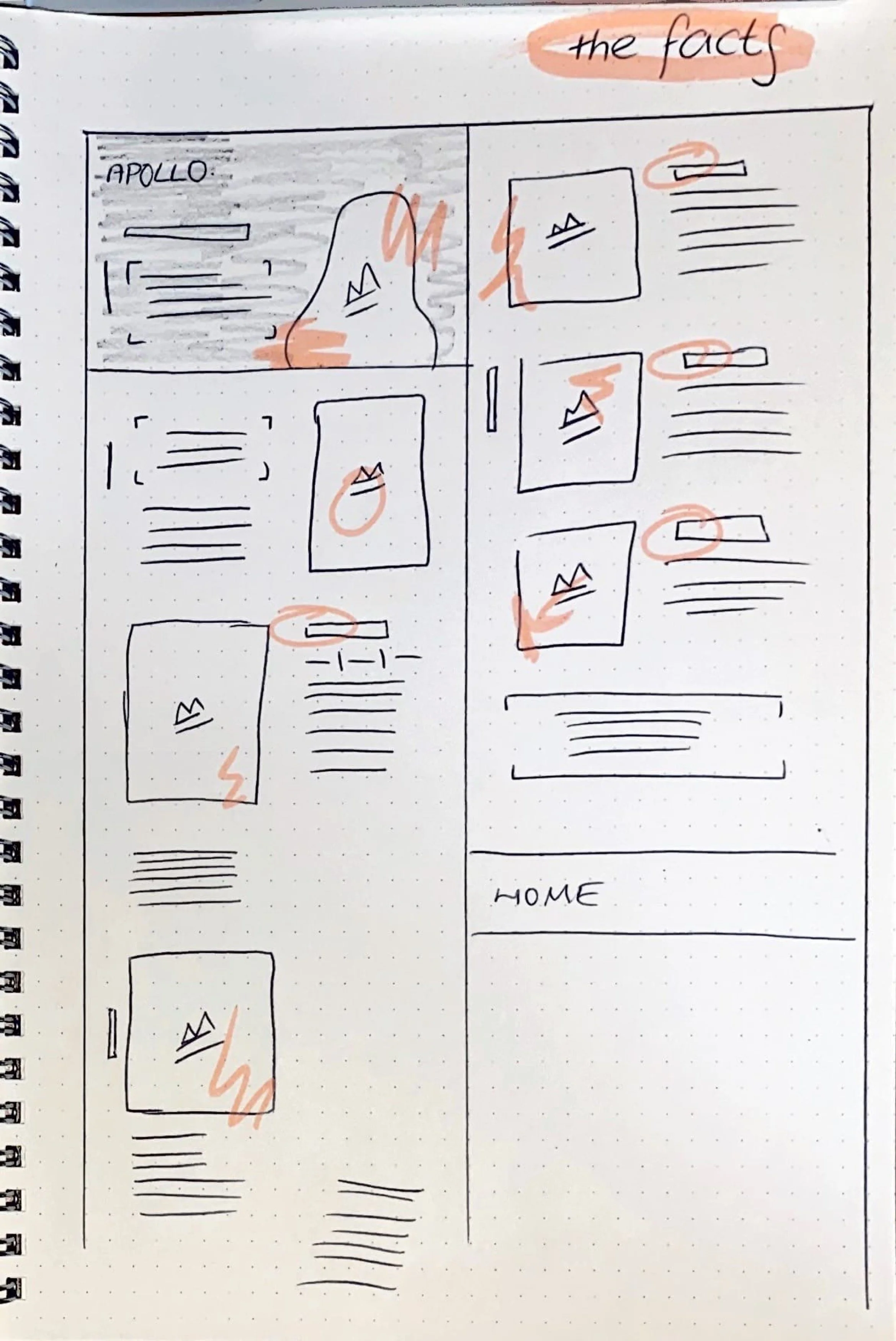
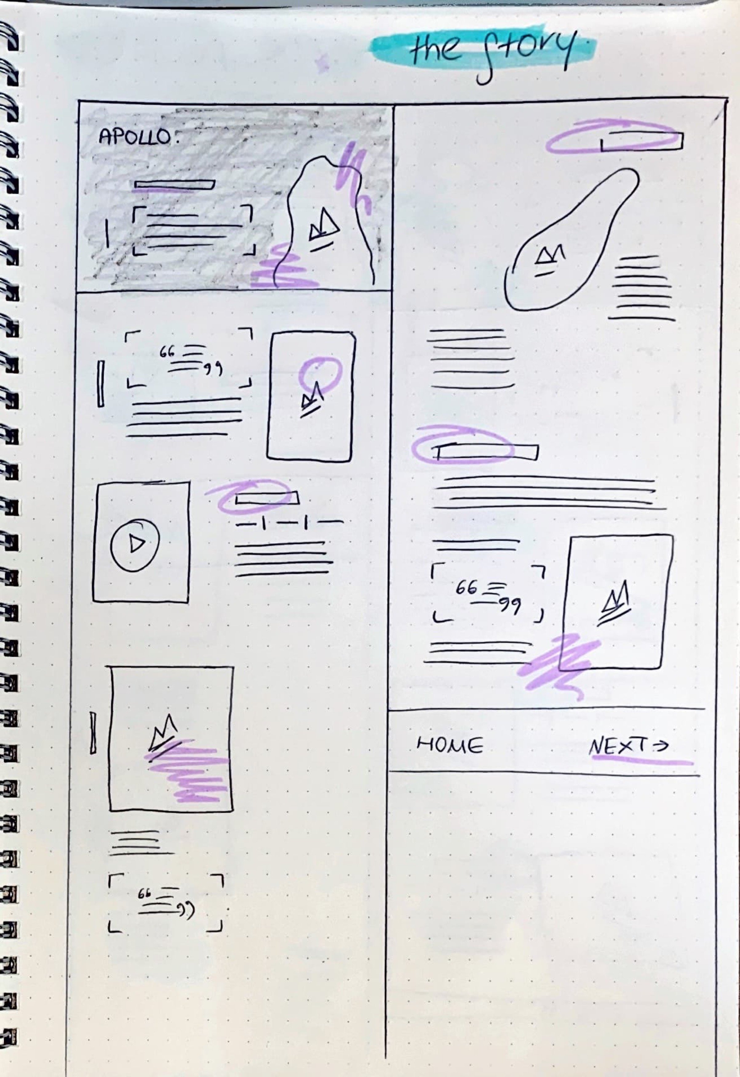
I created low fidelity wireframes to look at the placement and sizing of the different elements in the website.
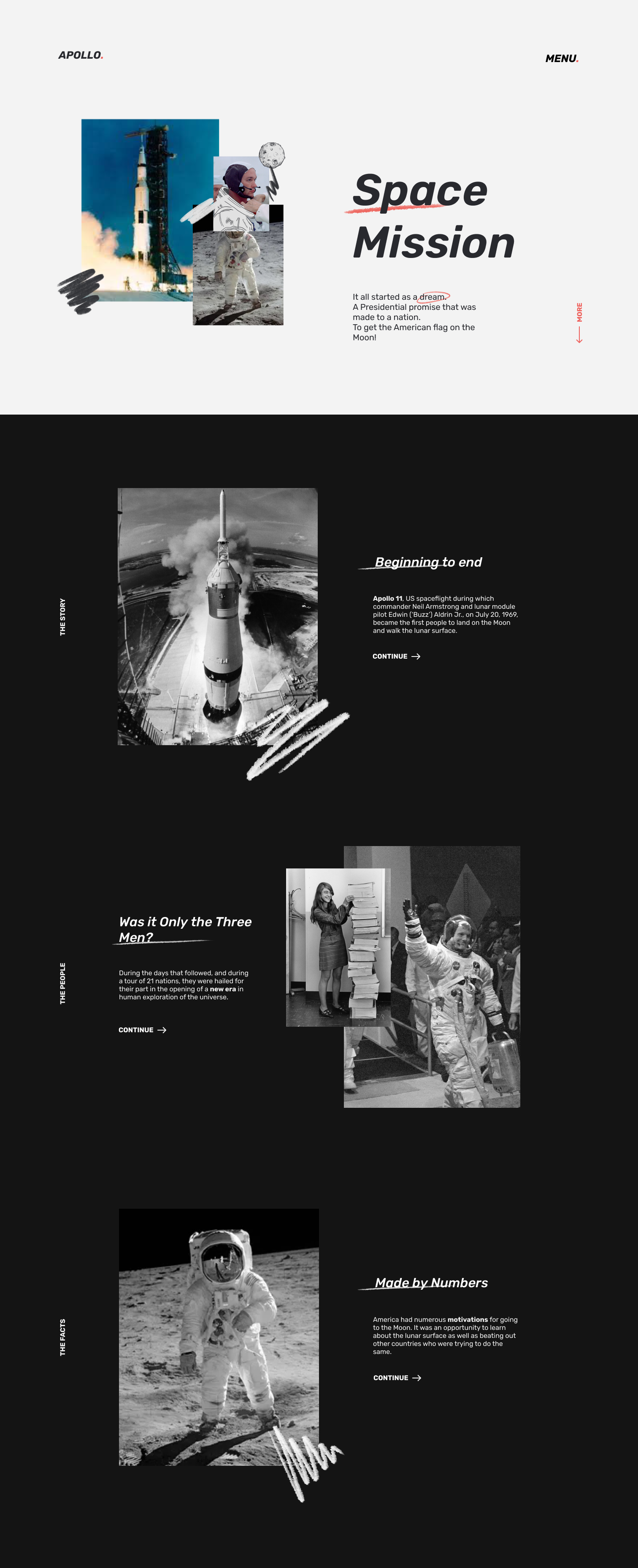
Taking the low fidelity versions, I placed the content into the screens, both text and images, which left me with my final wireframes.
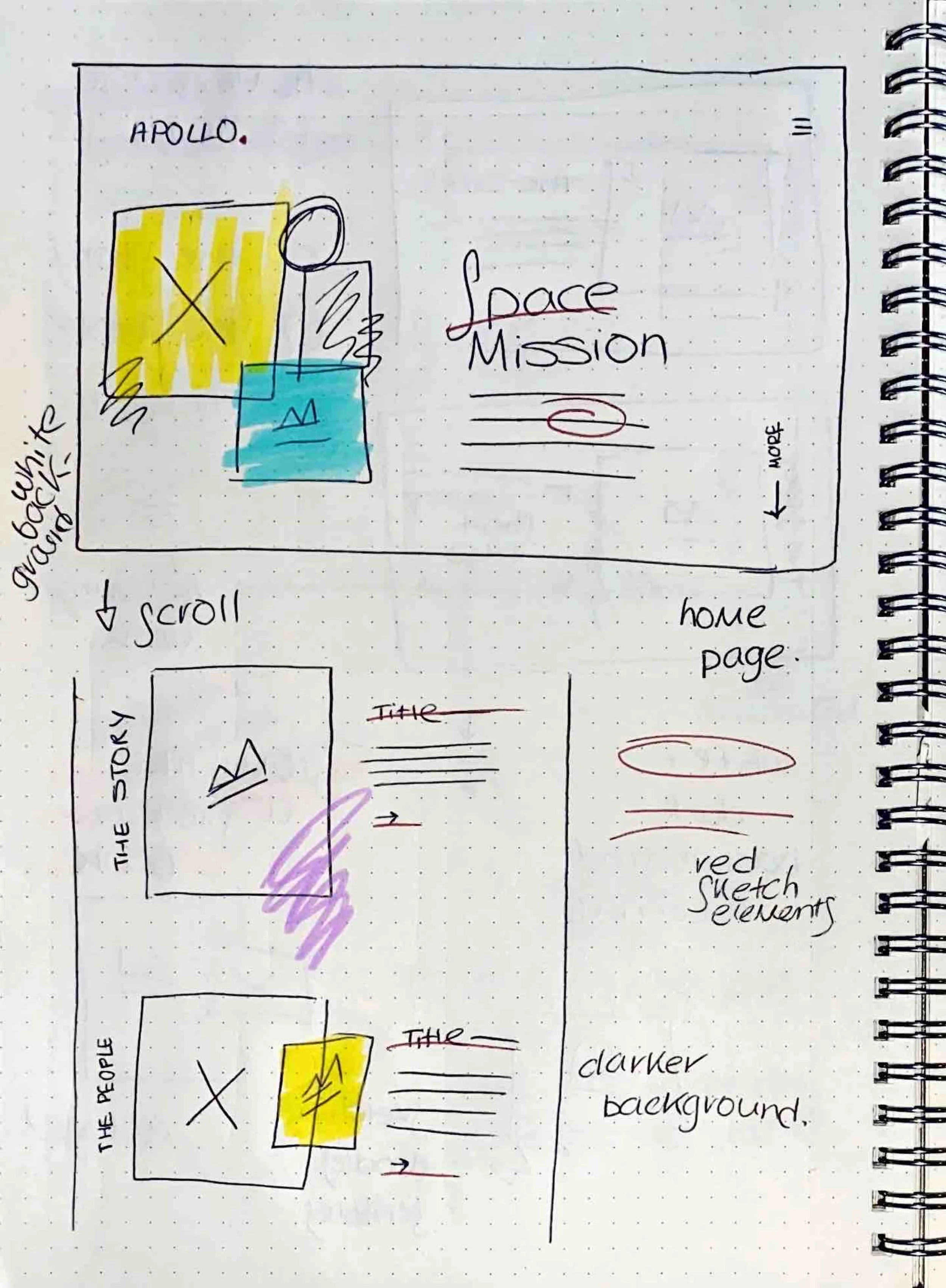
To link to the sketch style of my prototype (explored later in the page), I drew on top of some of the images in the style of my illustrations.
I used tools like Fontjoy and Type scale for typography styles and proportions. Additionally, utilising grid design was vital to make sure everything was aligned.


Moving Digital.
Prototype.
With the wireframes complete, I created a Figma prototype of the website to see the functionality before moving to work on Framer.
Website.
In my first attempt to use Framer, I was pleased with the final outcome. There are some features I wasn’t able to include, however most turned out well. Learning Framer was tricky at times, but I am now more skilful in the software.
Interactive Prototype.
Alongside the narrative website was an interactive prototype. It took on a similar sketched style.
Once again I began with my sketchbook and based the sketch wireframes around the illustrations I had created.
From here, I took these concepts and created more structured wireframes of the prototype. Here I began to consider possible colour options, as well as animations.


Creating the high fidelity mock ups was a fun process as I really enjoyed the design approach I had taken. My main element was my illustrations which I created as well as the colour options.
Prototype.
When it came to the prototyping process, it was much more straightforward due to the nature of my design. I felt this suited my design approach better, with it being minimalist and simplistic. However, this meant I had to make sure the prototype worked smoothly and there wasn’t any mistakes - or else it would have been very obvious.